

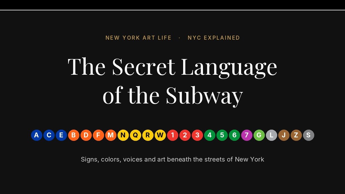
Colored circles, black signs, a voice that has said “stand clear of the closing doors” millions of times and a museum hidden behind the tiles. The first chapter of our new series explains the language New Yorkers learn underground without ever being taught.
NYC Explained is a new series by New York Art Life. Every week we explain one piece of the city’s culture, from its words and accents to its communities, its habits and its contradictions. Our aim is simple: to help you read New York the way New Yorkers do.
A City That Speaks Underground
Every weekday, millions of people go down the stairs of the New York City subway, and almost none of them think about how they know where to go. They read a black sign, look for a colored circle, listen for a few words through the speakers, and step onto the right train. On December 4, 2025, the subway carried 4.63 million riders in a single day, a post-pandemic record according to the MTA. Most of them moved through a system of 472 stations without asking anyone for directions.
That is possible because the subway has its own language. It is made of colors, letters, numbers, typefaces, tiles, recorded voices and a handful of words that every New Yorker understands. Some of it was designed with great care. Some of it was born by accident. In addition, a surprising part of it is art.
For visitors, this language can feel like a code. For New Yorkers, it is so familiar that they no longer see it. In this guide, we read it slowly, one sign at a time.
Colors, Letters and Numbers
The first thing anyone notices underground is the circles. New Yorkers call them “bullets”: round symbols with a letter or a number inside, each in its own color. They look simple, but they carry three layers of information at once.
Numbers and Letters
Numbered trains, from the 1 to the 7, run on the old IRT lines, the company that opened the first subway in 1904. Lettered trains run on the former BMT and IND networks. Two histories, two alphabets.
One Color, One Avenue
Since 1979, a bullet’s color tells you which trunk line the train uses through Manhattan. Blue is Eighth Avenue, orange Sixth Avenue, yellow Broadway, red Seventh Avenue, green Lexington Avenue.
Circles and Diamonds
A circle marks regular service. A diamond, on the same color, marks a variation, usually an express run at certain hours. Read the shape before you board.
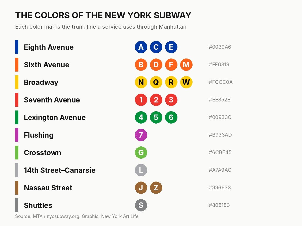
This system explains a question many visitors ask: why do the 4, 5 and 6 share the same green? Because they share the same tracks under Lexington Avenue. As a result, a New Yorker standing on a platform does not need to memorize every route. If the color matches, the train goes the right way through Manhattan. The color code also explains why the purple 7 to Flushing, the lime G that crosses Brooklyn and Queens without entering Manhattan, and the gray L along 14th Street each stand alone.
The Signs That Changed Design History
From Chaos to a Manual
Before the 1960s, the subway’s signs were a mix of styles left by three different companies. In 1966, the New York City Transit Authority hired Unimark International, the design firm of Massimo Vignelli and Bob Noorda, to bring order to that chaos. Noorda spent the summer studying how passengers moved through key stations. Then the two designers created a modular system of signs, placed exactly where riders need to make a decision.
The first results did not go as planned. The Transit Authority’s sign shop applied the designs on its own, and Vignelli later described the outcome as “the biggest mess in the world.” The answer was a book: the 1970 NYCTA Graphics Standards Manual, which set rules for every arrow, letter and color. Today it is one of the most famous documents in graphic design, reprinted for collectors and studied in design schools around the world.
Standard Medium “has been found to offer the easiest legibility from any angle.”
The Typeface Everyone Thinks Is Helvetica
Many people believe the subway was always written in Helvetica. In fact, as design historian Paul Shaw explained for AIGA, the 1970 manual specified a typeface called Standard Medium, quoted above, partly because Helvetica was not easily available to the sign shop at the time. Helvetica Medium became the official typeface only in December 1989, with a new MTA sign manual.
A Black Band Born by Accident
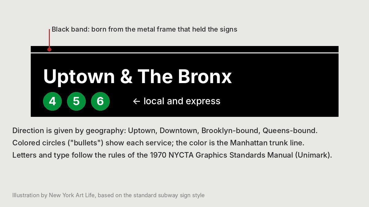
Look at the top of almost any station sign and you will see a thin black band with a white line under it. It was never meant to be there. It began as the shadow of the metal channel that held the sign panels, and designers liked it so much that the 1970 manual made it official. Meanwhile, the signs themselves switched from black letters on white to white letters on black in the 1970s, the look most riders know today.
Vignelli also designed a famous 1972 subway map that turned the city into clean diagonal lines and colored dots. New Yorkers found it beautiful but confusing, because it ignored real geography, and it was replaced in 1979. Its legacy survives, however: a copy is in the collection of the Museum of Modern Art.
Words Only New Yorkers Understand
The subway also has a spoken language. Learn these words, and you will sound like a local:
- Uptown and Downtown. In Manhattan, nobody says north or south. Trains go uptown, toward the Bronx, or downtown, toward Lower Manhattan and Brooklyn.
- Brooklyn-bound, Queens-bound, Manhattan-bound. Outside Manhattan, direction is named after the borough the train is heading to.
- Local and express. Local trains stop everywhere. Express trains skip stations and use the middle tracks. Taking the wrong one is a classic New York mistake.
- Straphanger. An old word for a subway rider, from the leather straps passengers once held.
- “Showtime!” The cry of performers about to dance around the poles of a moving car. Some riders love it, others hide behind their phones.
- “Train traffic.” The announcement every rider dreads, which means the train will wait, and nobody knows for how long.
- Tap. Since January 1, 2026, riders can no longer buy or refill a MetroCard. More than 93% already pay by tapping a card or phone on OMNY readers, so the old verb “swipe” is slowly disappearing.
The Voices of the Subway
“Stand Clear of the Closing Doors, Please”
Every New Yorker can repeat it, often in the same rhythm. The recorded voice behind the phrase on many trains belongs to Charlie Pellett, a London-born news anchor at Bloomberg Radio. Pellett and other Bloomberg journalists recorded announcements for the subway’s new-technology trains, and later recordings added voices with stronger New York accents.
The result is a curious mix. A city famous for its accents speaks to its riders, on many cars, in the calm tone of a radio newsroom. Yet that tone has become part of New York’s soundtrack, as familiar as sirens and car horns.
Music Below the Street
The other voices underground belong to musicians. Since a pilot in 1985, the MTA’s music program has selected performers through auditions and given them official spots in stations and rail hubs. According to the MTA, more than 150 performers and ensembles have played more than 8,500 performances. For live music in a club, see our recent preview of Alexis Cuadrado at The Jazz Gallery.
A Museum Hidden in the Tiles
The First Subway Spoke in Pictures
When the subway opened in 1904, its architects George C. Heins and Christopher Grant LaFarge decorated the stations with ceramic name tablets and pictorial plaques. These images had a practical purpose. At a time when many riders did not read English, a traveler could be told to get off at the stop with the picture of a beaver. That beaver is still at Astor Place, a tribute to John Jacob Astor, who made his fortune in the fur trade. According to the history of the original subway tiles, the decoration was both beautiful and functional.
Colors That Tell You Where You Are
Later, the city’s Independent Subway, opened in 1932, used simpler tiles in bands of color. The colors changed in a set sequence at each express station, so that riders could recognize their position on the line just by looking at the walls. In other words, the tiles were a map.
Today’s Underground Gallery
Today, MTA Arts & Design turns stations into one of the largest public art collections in the city. At 14th Street and Eighth Avenue, Tom Otterness’s bronze figures, Life Underground (2001), hide under stairs and benches: an alligator rising from a sewer, workers with giant tools, figures sweeping up pennies. On the Second Avenue Subway, opened on January 1, 2017, four artists created works for four stations: Jean Shin at 63rd Street, Vik Muniz at 72nd Street, Chuck Close at 86th Street and Sarah Sze at 96th Street.
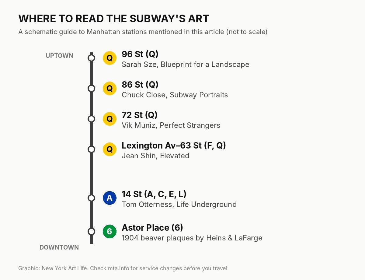
At 86th Street, Chuck Close’s Subway Portraits include twelve large works in mosaic and ceramic tile, with faces of cultural figures such as Philip Glass, Kara Walker, Cindy Sherman and Lou Reed. At 72nd Street, Vik Muniz’s forty mosaic figures look like the riders standing in front of them. For more art you can see for the price of a ride, browse our Art section.
What the Subway Says About New York
Seen as a whole, the subway’s language tells the story of the city. Its first pictures were made for immigrants who could not yet read the signs. Its colors and letters show how three rival companies became one public system. Its modernist signs reflect New York’s ambition in the 1960s, while its mosaics show a city that still believes public spaces deserve beauty.
The subway also mirrors New York’s contradictions. A rider from the Upper East Side and a rider from the South Bronx share the same car, the same voice and the same “stand clear of the closing doors.” For a few minutes, it is one of the most democratic places in the city. As a result, learning its language is one of the first steps to understanding New York itself. For more stories about the people and places of the city, read our NYC Stories, and for this weekend’s picks, see What to See in NYC This Weekend.
Explore the Subway’s Language
You do not need a ticket to a museum to see the subway’s art and design. A single ride lets you read a century of New York history. Start at Astor Place, ride the Q to the Upper East Side, and stop at 14th Street on the way back. Before you go, check service changes on the MTA website, especially on weekends.
Plan Your Visit
A Subway Art and Design Itinerary
- Astor Place (6)
- Original 1904 beaver plaques by Heins & LaFarge
- 14 St (A, C, E, L)
- Tom Otterness, Life Underground (2001)
- Lexington Av–63 St (F, Q)
- Jean Shin, Elevated
- 72 St (Q)
- Vik Muniz, Perfect Strangers
- 86 St (Q)
- Chuck Close, Subway Portraits
- 96 St (Q)
- Sarah Sze, Blueprint for a Landscape
- Fare
- One subway ride, paid by tapping a contactless card, phone or OMNY card
- Info
- MTA Arts & Design · mta.info
