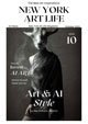


There is a particular kind of designer who refuses to be sorted. That will spend a Tuesday afternoon wrestling with a construction jobsite management interface and a Wednesday evening pulling a brush pen across paper in search of the exact weight a letter needs to feel alive. Who treats a mobile app’s App Store rating as a design problem with the same seriousness he brings to a hand-lettered aphorism about money, meaning, and the cost of losing yourself to commercial ambition. Saawan Ebe is that designer, and he has spent more than fifteen years refusing the false choice between the practical and the poetic.
Born in India and trained as a mechanical engineer at BITS Pilani, Ebe arrived in New York in 2013 to pursue his MFA at the School of Visual Arts, a move that would permanently alter the trajectory of his practice. SVA gave him not just skills but a philosophy: concept first, always. Under mentors like Stephen Doyle and the influence of program co-chair Steven Heller, he developed a design sensibility rooted in the tradition of Paul Rand and Herb Lubalin, designers who understood that rigor and wit are not opposites but partners. His MFA thesis, Type Aakriti, was a digital platform built to celebrate India’s extraordinary typographic heritage, and it announced something important about who Ebe would be as a creative professional: someone who sees cultural depth as a design resource, not a decoration.
Since graduating, Ebe has built a product career of genuine consequence. At Nulab, he led the redesign of the Backlog mobile app from the ground up, lifting its App Store rating from 2.5 to 4.6 stars and doubling its monthly active user base. At Fieldwire, a construction technology platform later acquired by Hilti for a reported $300 million, he designed features that drove a 90% increase in location data captured and achieved 85% adoption within the first year on a brand-new product surface. He currently serves as Senior UX Designer at Trimble, a billion-dollar construction software company, where his most recent high-visibility project earned direct executive recognition. Along the way, he also ran Studio Saawan, a boutique independent practice where he shaped the brand and product identity of what was then a scrappy startup called InterviewStreet, now known globally as HackerRank, valued at over $100 million.
But the résumé, impressive as it is, tells only half of the story. Running alongside that product career is an independent creative practice that encompasses hand lettering, calligraphy, editorial caricature, and brand identity work. Two of his logo designs appeared in Smashing Logo Design in 2011. Two of his lettering pieces were published on the SVA MFA Design blog by Steven Heller himself. His caricature portraits of figures like Conan O’Brien, political candidate Zohran Mamdani, and tech creator MKBHD carry the unmistakable sensibility of an editorial illustrator who reads broadly, thinks carefully, and reaches for wit before cruelty every single time. He publishes philosophical essays on Substack, reflecting on contentment, greed, and the human condition through the lens of literature and culture, and his most recent post, a meditation on the lives and legacies of Lata Mangeshkar and Asha Bhosle, is the kind of writing that makes you wonder whether design is his primary language or simply the most visible one. We spoke with Saawan Ebe about all of it.
New York Art Life: You studied mechanical engineering in India before pivoting to design. That feels like a significant leap. What was the internal logic of that transition?
Saawan Ebe: It probably looks like a leap from the outside, but it never felt that way from the inside. I was always drawing. Lettering, illustrations, logos, I was doing that throughout my engineering years at BITS Pilani. Engineering gave me a way of thinking about problems structurally, understanding how systems interact, and identifying where the failure points live. Design turned out to use all of that. The difference is that in design, the human being is always in the picture. You are not just solving for how the parts fit together; you are solving for how the parts feel to the person who has to live with them. I did not abandon engineering thinking when I moved into design. I brought it with me and aimed it at different questions.
New York Art Life Magazine: You moved to New York in 2013 for your MFA at SVA. What did that program give you that you could not have found elsewhere?
Saawan Ebe: It gave me a framework for the way I already believed work should be made, but could not yet articulate. The SVA MFA Design program is deeply committed to concept-driven thinking. The idea that every visual decision must earn its place, that form without rationale is noise, was something I felt intuitively before I arrived, but SVA gave me the language and the rigor to practice it consciously. Working under Stephen Doyle was formative. He has this incredible ability to find the idea inside the brief and make it sing. And Steven Heller, as program co-chair, created an environment where design history and design criticism were not separate from making; they were tools for making. I left SVA understanding why I believed what I believed. That clarity has never left me.
New York Art Life Magazine: Your MFA thesis, Type Aakriti, was a platform celebrating India’s typographic heritage. Can you talk about where that idea came from and what it meant to you personally?
Saawan Ebe: India has twenty-two officially recognized languages and dozens of distinct writing scripts. Each one carries its own visual logic, its own relationship between form and sound, its own centuries of typographic development. And yet when you look at how Indian scripts are represented in global design culture, there is so little, so much of that richness goes unseen. Type Aakriti came from wanting to change that. I wanted to build something that would make India’s typographic diversity legible to a wider audience and help designers discover and engage with scripts beyond the Latin alphabet. It was a thesis project, yes, but it was also a personal act of cultural reclamation. I am from India. I carry those scripts in my history. Building a platform to celebrate them was not just an academic exercise, it was a way of saying that this heritage deserves to be seen.
New York Art Life Magazine: Two of your lettering pieces were published on the SVA MFA Design blog by Steven Heller. What does recognition from someone with that level of critical authority mean to a designer?
Saawan Ebe: It meant that the work was communicating beyond the classroom. Steven Heller has spent decades as one of the most important voices in design criticism and design history. He has championed the kind of work that has both intellectual weight and visual wit. When someone with a critical eye looks at what you have made and decides it deserves to be shared, it tells you something important: that the approach is working and that the values are landing. It also creates responsibility. Recognition like that is not permission to relax; it is a reminder of the standard you need to keep up with. I carry that with me.
New York Art Life Magazine: At Nulab, you led the redesign of the Backlog mobile app and took the App Store rating from 2.5 to 4.6 stars while doubling the user base. That is a remarkable turnaround. What was broken, and how did you diagnose it?
Saawan Ebe: The app had accumulated years of decisions that were each individually defensible but collectively incoherent. The navigation was confusing. The visual language was inconsistent. Core flows required too many steps. Users were not failing because they lacked patience; they were failing because the product was not respecting their time or their mental model of how project management should work. My diagnostic process started with a deep focus on where users were dropping off, what they were asking for in reviews, and what the core jobs-to-be-done actually were. Once I understood what users needed to accomplish and where the current experience was blocking them, the direction of the redesign became clear. It was about consistency, simplicity, and trust. When users feel like an app is working with them rather than against them, they come back. The numbers followed the craft.
New York Art Life Magazine: At Fieldwire, you designed features that drove a 90% increase in locations captured and 85% adoption of a new product surface within the first year. Tell us about the design thinking behind those outcomes.
Saawan Ebe: The locations feature came from a very specific research insight: users on complex job sites were not organizing their location data because the existing system made nesting feel like a chore. You had to manually create each level of hierarchy. For a project with dozens of floors, rooms, and zones, that was genuinely painful. I designed an expandable nesting structure with drag-and-drop CSV import, so teams could define their entire location hierarchy in a spreadsheet and bring it into the platform in seconds. That change removed the friction that was blocking adoption. When you remove friction that users genuinely feel, adoption follows almost automatically.
The Specifications feature was a different kind of challenge. Fieldwire was primarily a field-execution tool, and Specifications was meant to bring the platform into project-management territory. That meant designing a workflow that people who had been thinking about Fieldwire one way would suddenly use for a different class of problem. The three-step workflow with version control and cross-linking was designed to feel inevitable, each step leading logically to the next, with no unnecessary decisions along the way. An 85% adoption rate in the first year means that people who needed the feature found it, understood it, and kept using it. That is the goal.
New York Art Life Magazine: You ran Studio Saawan independently for years and worked with InterviewStreet, now HackerRank, early in its history. What does it mean to shape a brand before anyone knows what it is going to become?
Saawan Ebe: It is one of the most creatively alive situations a designer can be in. There is no legacy to protect, no established visual language to maintain consistency with. There is just the idea of the company, the founders’ values, and the problem they are trying to solve. At InterviewStreet, I was designing for a team that deeply believed in skills-based technical hiring. The brand needed to communicate rigor, intelligence, and accessibility simultaneously. I designed the brand identity, the website, and the product UX, all of it pointing toward the same north star. Watching that company grow into HackerRank, with its $100 million-plus valuation and global reach, confirms something I believe about early-stage design work: the clarity you establish at the beginning compounds over time. Get the foundation right, and everything built on top of it benefits.
New York Art Life Magazine: You have a parallel creative practice in hand lettering, calligraphy, and editorial caricature. How do you think about the relationship between those practices and your product work?
Saawan Ebe: They are not parallel in the sense of being separate. They are the same thing expressed in different registers. Both require you to understand the idea before you touch the tool. In lettering, you are not just drawing letters; you are making an argument about how a word or phrase should feel, what emotional weight it should carry, and how the reader should experience the meaning. In product design, you are not just arranging interface elements; you are making an argument about how a user should move through a problem, what cognitive load is appropriate at each step, and how the experience should feel at the end. The discipline is identical. The materials are different.
Caricature adds another layer. Editorial caricature is about finding a person’s essential truth and amplifying it just enough to make you see something you might have missed. It is the same instinct that drives good information architecture: what is essential, what is noise, and how do you make the essential impossible to miss?
New York Art Life Magazine: Your approach to caricature is specifically about wit over cruelty. In an era where visual commentary tends toward the vicious, that feels like a deliberate and somewhat countercultural choice.
Saawan Ebe: It is absolutely deliberate. I think cruelty in caricature is lazy. It substitutes shock for insight. Anyone can exaggerate a feature to make someone look monstrous, that requires no real understanding of the subject. What takes skill is finding the thing about a person that is true and interesting and perhaps slightly absurd, and rendering it in a way that makes the viewer smile because they recognize it. That moment of recognition is the goal. When I drew Conan O’Brien, I was not trying to make him look foolish. I was trying to capture the particular quality of his comedic intelligence, the way his mind moves, the slightly anarchic energy he carries. Wit invites the viewer into a shared observation. Cruelty just attacks. I am not interested in attacking.
New York Art Life Magazine: You created the aphorism “The value money creates often devalues us” during your MFA studies at SVA under Stephen Doyle, and you rendered it as a hand-lettering piece. Can you unpack what that phrase means to you?
Saawan Ebe: It came from a long conversation I was having with myself about what design is for. There is enormous pressure in any creative career to optimize for commercial success, to take the work that pays best, to make yourself legible to the most lucrative market, to measure the value of what you do in dollars, downloads, or engagement metrics. And I understand why. The economics of creative work are genuinely hard. But that pressure, if you give it too much authority, starts to erode something. It starts to make you design for the brief rather than for the person. It starts to make you answer the client’s question rather than ask whether it’s the right one.
The phrase is not an argument against fair compensation. I believe strongly that designers deserve to be paid well. What it is questioning is the framework that makes money the primary measure of a design’s value. The most meaningful design I have ever done — for users, for culture, for the people who interacted with it- was not always the most commercially rewarded. And some of the most commercially successful designs I am aware of in the industry is work that treated people as conversion targets rather than human beings. That inversion troubles me. The aphorism is a reminder to keep the human being at the center, even when the incentive structure pulls in another direction. I chose to render it as a lettering piece because a hand-drawn piece carries a quality that a typeset quote cannot, the mark of the human hand, the evidence of time and attention, the thing that money cannot fully replicate.
New York Art Life Magazine: You publish essays on Substack about contentment, greed, and the human condition, and your most recent piece is a meditation on Lata Mangeshkar and Asha Bhosle. How does writing feed your design practice?
Saawan Ebe: Writing forces precision. You cannot hide behind a beautiful visual when you are writing; the idea either stands up or it does not. Every essay I write is an exercise in figuring out what I actually think, not what I assume I think. The Lata and Asha piece started as a personal memory. I was ten years old when I first encountered their music, and there was something about hearing Asha’s 1960s recordings remixed in the mid-1990s that made time feel very strange and very rich. As I wrote, I found myself thinking about longevity, about relevance, about what it means to keep creating into the later decades of your life without calcifying into nostalgia. Asha Bhosle’s final song was a collaboration with Gorillaz. She was ninety-two years old. She was still reaching outward, still finding new collaborators, still asking what comes next. That is a model I carry with me.
Writing about culture and philosophy keeps me in touch with what design is ultimately in service of: the full complexity of human experience. When I come back to a product problem after writing an essay, I am a better designer because I have been reminded of what is actually at stake.
New York Art Life Magazine: Your design philosophy is explicitly connected to Paul Rand and Herb Lubalin. What do those figures represent to you, and what do you think contemporary design culture gets wrong about their legacy?
Saawan Ebe: Rand and Lubalin both understood that design is a discipline of thought, not just a discipline of form. Rand was famous for his belief that a designer’s job is to solve problems — not to impose personal style but to find the visual logic that the problem itself demands. Lubalin had a gift for finding the conceptual possibility hiding inside a piece of typography: the way a letter could become an image, the way spacing could carry meaning, the way the word itself could be the idea. Both were unafraid of wit and unafraid of rigor, and they held those qualities together without apology.
What contemporary design culture sometimes gets wrong about its legacy is treating it as a style rather than a method. You see designers who study Rand and produce work that looks like Rand, as if the geometric reduction and the bold primary colors were the point. The point was the thinking. The point was that every decision had a reason. You could apply that discipline to a Figma prototype or a mobile app flow just as legitimately as to a corporate identity system. The medium changes. The obligation to think before you mark does not.
New York Art Life Magazine: At Trimble, you led the redesign of the Workload Calendar, a feature where an underperforming MVP had damaged customer trust. How do you approach the particular challenge of fixing something that has already hurt the people it was meant to serve?
Saawan Ebe: You start by acknowledging the damage honestly. A feature that has eroded customer trust is not just a UX problem; it is a relationship problem. Users who have been burned by a bad experience bring skepticism to every subsequent interaction with that surface. You have to design for that skepticism. It is not enough to make the feature functionally correct. It has to feel trustworthy, which means it has to be predictable, consistent, and transparent about what it is doing and why.
With the Workload Calendar, I started with JTBD (Jobs To Be Done) research to understand what users actually needed from that surface before making any design decisions. The existing MVP had been built on assumptions that turned out to be wrong, and no amount of visual polish was going to fix a wrong assumption. Once I understood the real job users needed done, I could reframe the design strategy entirely. I prototyped the solution, validated it with users, and worked closely with engineering to ensure that implementation matched intent. The fact that the launch earned executive recognition matters, but what matters more is that it closed a real competitive gap and gave users a reason to trust the surface again.
New York Art Life Magazine: Three of your logo designs appeared in Smashing Logo Design in 2011, early in your career. What does it mean to have work recognized at the intersection of craft and commercial design?
Saawan Ebe: It meant that the discipline was paying off. Logo design is one of the most demanding forms of graphic design because the constraints are so severe. A logo must work at any size, in any color, in any context. It must communicate the essence of an organization or product in a single mark. There is nowhere to hide complexity or compensate for weak ideas with visual decoration. When three of the marks I designed were selected for that publication, it confirmed that I was working at a level where the ideas were strong enough to stand on their own. That confirmation mattered to me then, and it still informs how I approach mark-making today.
New York Art Life Magazine: Looking across your entire career, product, lettering, caricature, brand identity, writing, what is the single thread that runs through all of it?
Saawan Ebe: Intentionality. Every piece of work I am proud of, whether it is a mobile redesign that doubled a user base, a hand-lettered aphorism that took an afternoon to compose, a caricature portrait that captures something true about a public figure, or an essay about two sisters who kept singing into their nineties, began with a question: what is this actually for?
That question sounds simple, but it is the hardest discipline I know. The pressure to skip it is enormous, especially in product design, where speed is prized, and the gap between a decision made carefully and a decision made quickly is often invisible until months later, when retention starts to slide, or a feature nobody uses sits quietly in the interface like a monument to a wrong assumption. I have worked in environments where the pace was so fast that intentionality felt like a luxury. I have learned that it is not a luxury; it is the load-bearing wall. Everything else rests on it.
When I draw a letter by hand, I am asking what weight, what angle, and what rhythm will make this word feel the way it should. When I design a product flow, I am asking what cognitive load is appropriate at this step, what the user already knows, what they need to learn, and how to make the next action feel inevitable rather than arbitrary. I write an essay, I am asking what I actually believe, not what is convenient or impressive to say. The discipline is the same in every medium.
The designers I most respect, Rand, Lubalin, Doyle, Heller, as a critic, all operated from that same discipline. They were not interested in novelty for its own sake. They were interested in solving the problem before them with the greatest precision and wit they could bring to bear. That is what I am trying to do. I have been trying to do it for fifteen years, across two continents, in two very different creative registers, under the constraint of a visa structure that did not always make it easy, with the knowledge that the work is only ever as good as the intention behind it, and I do not think that ever changes. I do not want it to change.
New York Art Life Magazine: Finally, what do you want people to understand about your work that they might not immediately see when they look at it?
Saawan Ebe: That it is all one thing. I think people sometimes look at a product designer who also does lettering and caricature and assume that one of those things is the real practice and the other is the hobby. Neither is the hobby. They are both the practice, and they make each other stronger in ways that are not always visible in the finished work.
The reason I can design a mobile app that users actually trust is partly that I have spent years asking what a single letterform needs to do to feel right, and my caricatures have a point of view, partly that I have spent years solving product problems where the point of view had to be clear enough to guide an engineering team across six months of sprints. The reason my writing has a design sensibility is that I approach an essay the way I approach an interface: what is the user’s journey through this, where does the complexity live, and how do I make the essential things impossible to miss.
I also want people to understand that this work comes from a real place. I am an international artist from India who fell in love with American design culture through books about Paul Rand and the history of Push Pin Studios before he ever set foot in New York. Who arrived in this city in 2013 with an engineering degree, a portfolio of lettering work, and a conviction that the two things were not as far apart as people assumed. Who built a career across product and craft under conditions that were not always accommodating, and who made every piece of independent work with the full knowledge that it had to earn its existence, that there was no casual creative output, only considered creative output.
The aphorism I made during my MFA says it best: “The value money creates often devalues us.” I have held that sentence close for a decade, not as a rejection of the commercial world I work in, but as a reminder of what I am working for inside it. I am working for the person on the other end, the construction worker who needs to find a drawing on a jobsite, the project manager who needs to trust that the app in their pocket will not waste their time, the reader who encounters a piece of lettering and feels something they were not expecting to feel. That person is the measure. Not the revenue metric, not the adoption curve, not the publication credit, though all of those matter. The person is the measure. That has always been the answer to the question of what the work is for.
Saawan Ebe’s portfolio is available at saawanebe.com. His lettering and illustration work can be found on Instagram at @saawan. His essays on design, culture, and philosophy are published on Substack at madebysaawan.substack.com. He is currently based in San Francisco.
